The Dashboard stacks top to bottom in clear bands: a hero row (your greeting on the left, Today's focus on the right), the System Health banner, a strip of KPI cards, and then the larger charts. If you just want the lay of the land — the sidebar plus a quick pass over each band — read the Platform quick tour first; this guide is the level deeper. Everything below the greeting is a presentation layer over what your Clones, Connections and conversations actually do, so on a brand-new account most cards read — or 0 until things start moving.
The hero row: greeting and Today's focus
The top band is two cards side by side. On the left is the greeting card: your avatar, a time-of-day greeting, your email, and a short status line. The greeting itself changes with your local clock — Good morning, Good afternoon or Good evening — followed by your name (it quietly drops the name if you never set one, since a new account's name defaults to your email).
Under the greeting sits a one-line summary of what's waiting on you. When nothing is, it reads "You're all caught up across your clones." When something is, it counts it — for example "You have 2 pending approvals and 1 handover request across your clones." Below that, three meta chips show your plan (with a TRIAL tag if you're on a trial), your units in the form 104 of 2,500 units · 2,396 LEFT, and an Active until date.
If a subscription payment falls behind, the plan chip also grows a red Past due (or Unpaid) pill next to the plan name. If you hold Manage plan and billing, click it to open a quick pay panel — "Your last payment didn't go through. Update your billing to keep your plan active." — where you settle the outstanding invoice in one click and reactivate your plan. See A renewal payment didn't go through for the full flow.
The Active until chip shows your plan's period-end (renewal) date — the same date you'll see in Your plan under Account settings. It is not the units-reset date. The separate units-cycle reset — when your monthly allotment refills — lives on the Billing tab, in the Plan units remaining box as a Resets… line.
While you have plenty of units the greeting card stays quiet. Once you drop below 15% remaining it grows a low-units banner (with Buy units and Upgrade plan buttons; Buy units shows only to people who hold Manage plan and billing, because it buys units for the account you're working in), and below 5% — or at zero — it turns to a red critical banner warning that AI responses will pause when you run out. The same thresholds drive the UNITS gauge further down the page, so the two always agree.
The right card is Today's focus — think of it as a short daily to-do list the Dashboard builds for you. Its header carries a counter of open items, and below it sit a few prioritized rows. Each row has a coloured icon badge, a label, a meta line, and a button that either takes you to the right page or opens the right panel.
| Focus row | When it appears | Its button |
|---|---|---|
| N conversations awaiting handover | A human takeover was requested in one or more conversations | Review (opens Messages) |
| N responses pending approval | Replies to post comments are held waiting for your authorization before they send | Review (opens Post replies) |
| N unread notifications | You have unread notifications | Open (opens the notifications flyout) |
| N reviews flagged as spam or abusive | The Reviews module flagged reviews that wait on your decision | Review (opens Reviews) |
| N reviews need approval | Reviews are held before going live | Review (opens Reviews) |
| N published reviews have no reply | Published reviews have been live for more than 3 days with no reply | Reply (opens Reviews) |
| N questions are unanswered | Questions asked on your product pages are waiting for an answer | Answer (opens Reviews) |
| All caught up | Nothing is outstanding — the list's calm state | Refresh (re-checks for new items) |
Rows that don't apply simply aren't shown, so the list stays tight — and every row except All caught up carries an × Dismiss button that hides it without resolving it (a dismissed row comes back once its count grows past the number it was dismissed at). When there's nothing to do, you get a single All caught up row reading "Nothing needs your attention right now" — and the counter reads 0. When there is work, the counter is the number of open rows — it's a tally of what's waiting, not a checklist you tick off by hand.

Your KPI cards
Below System Health is a grid of small KPI cards. The first four are always visible; a Show N more toggle reveals the rest, and a gear button next to the toggle opens the customizer (covered at the end). Out of the box the four on top are Messages Responded, Pending Approval, Handover Requested and Active Conversations.
Every card has the same anatomy: a small label top-left, an outline icon top-right, a big value (sometimes with a unit tail like % or / 100), a muted sub line, and — bottom-right — a delta pill. The pill is the part worth understanding well, because the same red pill can mean two completely different things.
Grey em-dash (—) — nothing to show: either nothing changed, or this card has no earlier value to compare against yet. Green pill, up-chevron (e.g. +3) — a positive movement. Red pill, down-chevron (e.g. +50 or -0.5%) — see the next paragraph, because red means one of two things.
Here's the key distinction. On trend cards, the pill is a comparison: green-up means the number rose versus the previous period, red-down means it actually fell. Conversion Rate is the clearest example — its pill is the signed difference versus last month, so a red -0.5% is a genuine dip. On attention cards, a red pill is not a bad trend at all — it's a count of things waiting for you right now. Unread Notifications showing a red +50 means you have 50 unread notifications, full stop; it's a backlog flag, not a falling metric. When an attention card's count is zero, its pill goes grey — and its sub line reads All clear.
If the card's sub line says Needs attention / Unread (or All clear when empty), its red pill is a queue count — clear the queue and it goes grey. If the sub line is something like vs last month, the red pill is a real downward trend. The three attention cards are Pending Approval, Handover Requested and Unread Notifications.
This table maps every KPI to its value, its sub line and exactly how its pill behaves. The four marked are the default-visible top row; the rest live under Show N more.
| KPI card | Value | Sub line | Pill behaviour | Type |
|---|---|---|---|---|
| Messages Responded | count | Last 7 days | Always grey dash (no comparison) | — |
| Pending Approval | count | Needs attention / All clear | Red +N when > 0, else grey dash | Attention |
| Handover Requested | count | Needs attention / All clear | Red +N when > 0, else grey dash | Attention |
| Active Conversations | count | Last 7 days | Always grey dash | — |
| Total Contacts | count | N in the last 7 days | Green +N when new contacts in the last 7 days > 0, else grey | Trend |
| Active Leads | count | N qualified | Always grey dash | — |
| Conversion Rate | value + % | vs last month | Green up / red down vs last month; grey if equal | Trend |
| Clone-Assisted Sales | count | Last 30 days (with the attributed revenue once there is some) | Green up / red down vs the 30 days before; grey if equal | Trend |
| Avg Engagement | value + / 100 | score out of 100 | Always grey dash | — |
| Active Handovers | count | Currently with agents | Always grey dash | — |
| Pending Reviews | count | Needs attention / All clear | Red +N when any wait, else grey dash | Attention |
| Average Rating | value + / 5 | names the averaging window | Green up / red down — here up is good; dash when a window is empty | Trend |
| Unread Notifications | count | Unread / All clear | Red +N when > 0, else grey dash | Attention |
Pending Approval — and the matching Today's focus row — counts held replies to post comments only. Direct messages held for review (a connection's Direct-message review option set to Hold until approved) don't appear here: review them on the Messages page, where each conversation shows a pending badge. Don't sit on those — on WhatsApp, Instagram and Messenger a held reply expires and can no longer be sent if it isn't approved within the platform's 24-hour reply window. They do count in the Response Status chart's Pending bucket, so that chart can show Pending while this card reads All clear.
Active Leads counts leads currently in the Cold, Warm, Hot or Qualified stages — Converted and Lost don't count. It's a snapshot of right now, with no time window, and it doesn't merge the same person across channels: someone with contact rows on Instagram and WhatsApp can contribute more than one active lead. The sub line counts the Qualified ones.
Conversion Rate is calendar-month math, in UTC — not a rolling 30 days: leads created this month whose current stage is Converted, divided by all leads created this month. A conversion is attributed to the month the lead was created, not the month it converted — which is why last month's figure can still move days after the month closed — and, like Active Leads, it doesn't deduplicate a person who exists on several channels.
The Dashboard shows two different conversion numbers. The Lead Pipeline footer's Conversion is Converted ÷ (Converted + Lost) over all time; the Conversion Rate KPI card is this month's created-and-converted ÷ created. They measure different things and needn't agree — a great historical closer having a quiet month can show 80% on one and 0% on the other.
Clone-Assisted Sales counts purchases made in the last 30 days within 7 days after your Clone helped that shopper in a conversation — a product search, a link it shared. The shopper is matched across all their linked contacts, so help on one channel counts toward a purchase recorded under another. Its pill compares with the 30 days before, and once a purchase is credited the sub line carries the revenue, for example 4,300 MXN attributed · last 30 days. Purchases that followed a sequence, a recovery flow or a broadcast are counted on their own in the Sales Recovery section, whose Influenced sales total combines the two. The card needs the View contacts permission and sits under Show more until you move it.
Avg Engagement averages each contact's engagement score, which runs 0–100: 40% frequency (their messages and conversations), 40% recency of the last interaction, 20% sentiment. Opens, comments and conversions don't feed it. It's a live snapshot with no period — and a contact with no activity at all sits around 14 rather than 0, because recency has a floor and sentiment defaults to neutral.
The two review cards read IcloneU's own Reviews module — not Google or Meta. Pending Reviews counts reviews waiting for approval, account-wide with no time window. Average Rating averages published reviews out of 5 — the last 30 days when the month has any, otherwise all-time — and its sub line names the window it used; with no published reviews it shows a dash, never 0.0. Both cards show only on beta accounts, like the Reviews section further down, and only to members with the View reviews permission; where they show, they arrive behind Show more unless you pin them with the gear — and remember that no KPI card is clickable; the Reviews section further down is where rows navigate.

The System Health banner
Between the hero row and the KPI cards sits the SYSTEM HEALTH banner. It runs a set of checks over your connections, Clones and knowledge sources and reports the result in one line. It has three looks: a blue running state — "Running health checks…" — while it works; a green passed state — "All systems healthy. X of Y checks passed." — when everything's fine; and a red failed state — "N of M checks failed. Open details to resolve." — when something's off, with a "last run" time alongside.
Two buttons sit on the banner. Details slides open a panel that breaks the run into ISSUES and PASSING, with a TOTAL / PASSED / ISSUES summary at the top; a failing check that's tied to a specific connection offers a Fix button that jumps you to that connection so you can reconnect it. Re-run runs the checks again on demand — useful right after you fix something.
One failing row never offers Fix: WhatsApp account, followed by the names of that WhatsApp Business Account's numbers. It appears when Meta refuses messages because of a problem with the WhatsApp Business account's payment method (Meta error 131042), and shows Meta's own error text. The fix is in Meta, not on the Connections page: resolve the payment problem there, as WhatsApp troubleshooting explains. The row clears by itself once a message is delivered again and the last payment failure is more than an hour old.

The charts
Below the KPI cards come the larger visual sections. Each has a title and lives in one of the section groups you can reorder or hide. We'll take them by theme — leads and contacts, then responses, then usage, then the per-Clone breakdown. (What you see depends on your permissions; some sections only appear if you can view contacts or responses.)
The charts that split activity by day — Messaging activity's sparklines, the daily unit spend bars and Clone performance's Messages handled — bucket each day by your browser's timezone. Not the server's, and not your account's reply-timing timezone: a message that lands at 7:30 PM your time counts on that day, and the newest bar carries today's local date. The IcloneU mobile app buckets by the device's calendar for the same reason, so the two agree.
Leads & contacts
These three live in the Lead & Contact Intelligence group.
- Lead Pipeline — six vertical bars for the funnel stages Cold → Warm → Hot → Qualified → Converted → Lost, each bar's height scaled to its count with the number printed inside. The subtitle reads {total} total leads · {qualified} qualified, and a footer shows three figures: Conversion (converted ÷ closed), Avg Score, and Hot + Qualified. The first five stages ramp from light to dark purple; Lost is red.
- Contacts by Platform — a donut splitting your contacts across channels, each segment in that platform's own brand colour (Instagram pink, WhatsApp green, and so on — the one chart that escapes the purple palette). The subtitle reads {N} contacts across {M} channels, and hovering a slice shows its count and share.
- Recent Buying Signals — a list of AI-detected purchase-intent moments (its subtitle is "AI-detected purchase intent"). Each row names the signal type and the contact, with a score bar underneath (green at 80+, amber 50–79, brand purple below) and the score plus a date on the right. Until any are detected it reads "No buying signals detected yet."
Top engaged contacts
The Top Engaged Contacts section is a table (titled Top Contacts) of your five most engaged contacts, with a View All link to the full Contacts page. Each row shows the contact (name + platform), an engagement score out of 100 drawn as a coloured bar and percentage, a type badge (Lead / Customer / Returning / VIP), a sentiment face, and the contact's total conversation count. Empty until you have contact data, where it reads "No contact data available yet."
Response analytics
The Response Analytics group holds two cards. The section header has a Refresh button and a date-range picker (Last 7 / 30 / 90 days, This month, This year).
- Response Types — a donut of your replies broken down by type, with a Filter button to scope it to all clones, posts, direct messages or chats. The subtitle counts what's in view, e.g. 186 replies · all clones. Read it as the mix of what kind of replies your Clones are sending.
- Response Status — a horizontal stacked bar reading Sent → Outbox → Pending → Cancelled → Failed, because delivery is a sequence, not a pie. A green % delivered chip sits in the header, and a five-up summary under the bar gives the exact count in each bucket. Outbox folds in replies still in flight to the platform, including retries; Pending is replies awaiting your authorization; Cancelled is its own bucket for replies you declined; Failed counts only genuine delivery failures. Read it as how far your replies got.
The donut's categories are the reply classifications — the same vocabulary you see on a reply's ⓘ popover in Messages and in the authorization checkboxes:
| Label | Means |
|---|---|
| Greeting | An opening or welcome |
| Answer | A question answered |
| No knowledge | No answer found in the clone's knowledge |
| Thank | Gratitude acknowledged |
| Congratulate | A congratulation |
| Negative | A negative comment handled |
| Spam | Classified as spam |
| Violence | Violent or self-harm content |
| Outside scope | Outside what the clone handles |
| Other | Anything else |
| Unknown | Not classified |
| Automation | Produced by an automation rather than the clone's AI |
The Filter narrows the donut to post replies, direct messages or chats, and the section's range selector (default Last 7 days) governs both cards. One nuance: the range is read on your own device's clock — the browser's timezone — so a last-7-days window means today and the seven days before it on your calendar, not the server's and not your account's reply-timing timezone.
Two nuances on Response Status: the % delivered chip deliberately leaves cancelled replies out of its denominator — rejecting proposed replies doesn't dent your delivery rate — and the five buckets always add up to the total shown, but that total only counts replies that travel the delivery pipeline, so live-delivered web-chat replies aren't in it.
Messaging activity
The Messaging Activity group is three small cards, each with a big number, a this week sub line, a delta chip versus the previous week (green up / red down / grey dash), and an area sparkline of the daily trend. They are Chat conversations, Message responses and Direct Message Conversations. The big number always counts the current week, Monday to today, on your own clock, so it starts again near zero every Monday. The section header's date-range picker drives the sparklines, and it also limits the chip: the chip compares the current part-week with only the days of the previous week that fall inside the picked range. With the default Last 7 days that is the whole previous week only on a Monday, and one day less on each day after, so the chip tends to read red early in the week and green late in it; pick Last 30 days to compare with the whole previous week. One exception: the chip finds the previous week on IcloneU's server clock, which runs on UTC, so on a Sunday evening in the Americas, once it is already Monday in UTC (from 6 PM in Mexico City), it compares the week with itself and shows a grey dash. Message responses counts only replies to post comments, so it usually sits below the Messages Responded KPI card, which counts every reply from your side in the last 7 days, whether or not it went out.
Usage & performance
The Usage & Performance group leads with three half-circle gauges. Each fills its arc by percent-used and tints itself as it climbs — brand purple when fine, amber for LOW / NEAR LIMIT, red for CRITICAL / AT LIMIT / OVER LIMIT — with a matching badge in the corner. A Manage plan link sits in the section header.
- UNITS — your unit balance: used against total capacity (plan grant plus any prepaid you've bought). The meta reads {N}% used · {M} remaining, and a Top up link opens the buy-units flow right on the page (the link shows only to people who hold Manage plan and billing). This gauge uses the same Low / Critical thresholds as the hero banner. Units power AI responses and storage overflow — see Understanding usage and limits for the full picture.
- KNOWLEDGE STORAGE — how much of your plan's knowledge-storage cap you're using, measured as post-conversion (compressed and transcribed) text in the vector store. When your plan includes none, it reads "Knowledge storage not included"
- DOCUMENT STORAGE — your plan's cap for raw uploaded files. Usage is measured live from your stored files; when it can't be read, the gauge shows — instead of a number.
The same group also charts your daily unit spend — a stacked bar per local day, split by what consumed the units — so a spike traces back to the feature that caused it.
Clone performance
The Clone performance section has its own filters — a Clone picker (or All clones), a Last 7 / 15 / 30 days range, and a Refresh button — and stacks three cards:
- Messages handled — daily message volume, stacked by platform, over the chosen range. Hovering a day shows that platform's count and the day's total.
- Top intents — the most frequent signals the Clone detected in conversations, as a short ranked bar list.
- Unanswered gaps — what the Clone couldn't answer, each with how many times it came up (e.g. 3×). Each row leads with a short description of what the customer wanted, written by AI in your interface language, with the customer's own message in small text beneath and a chip naming the kind of gap: Missing info, Unclear request, Unreadable file or Wanted a person. Only Missing info rows are worth adding to your Knowledge library — see Keeping your library up to date; the others are a request that never said which product or order the customer meant, an image or voice note the Clone couldn't read, and a customer asking for a person. Older rows show only the customer's message. IcloneU writes each description once, when the gap first appears, and that uses units.
Each of these cards shows "No data in this range yet." when there's nothing to plot — widen the date range or pick a different Clone if a card looks empty.
Five details worth knowing: the section's window and its daily bars follow your device's local calendar, not UTC — a conversation at 8 PM your time counts on that day. Messages handled is total message volume — the customer's own messages included — not just Clone replies. The intents and unanswered-questions lists are each capped at their top 5. Unanswered questions are grouped semantically by a nightly process, so "how much is it?" and "what's the price?" count as one gap. And there's no built-in action on a gap yet — for a Missing info row, add the answer to your Knowledge library by hand.
Reviews
The Reviews section summarizes the reviews collected by IcloneU's own Reviews module. A scope selector up top switches between All, Store and a specific product — and All and Store are not the same thing: a store review is one with no product attached, so Store is a subset, never the union of the products.
Seven header tiles follow: Total, Published, Pending (amber when any wait), Unanswered (amber when any), Average rating (a dash when nothing is published — never 0.0), % verified buyers, and Median approval time — the median minutes from a review's submission to a moderator's decision, over the last 90 days. Median on purpose: one review forgotten for three months would wreck an average. Accounts that auto-publish everything correctly show a permanent dash there.
Two bar panels break the reviews down — by classification (positive, neutral, negative, spam, abusive, plus unclassified, a legitimate bucket for CSV-imported reviews that never passed through the AI) and by stars from 5 down to 1, computed over published reviews. A review-request funnel (sent → received, with the rate) appears once you've sent any requests. At the bottom, the 5 most recent reviews — any state — each with stars, author, verified-buyer mark, product and status; clicking a row navigates to the Reviews page. The section requires the View reviews permission and appears only on beta accounts; every other account works with its reviews on the Reviews page itself.
Your Audience Avatar
The newest section of the Dashboard is an aggregated psychographic profile of your audience, generated from the customer voice your account already stores — published reviews, post comments and conversation messages. No external data is used.
When an avatar exists, the card shows: a portrait — a prose demographic summary with a confidence pill, the audience's awareness level with its rationale, and the corpus size used; a confirmation progress bar; three evidence columns — Goals & desires, Pains & frustrations, Objections — each entry backed by quotes; your customers' words — the literal phrases your audience uses; suggested hooks per stage, each with a button to use it directly in a broadcast; and a provenance footer with the generation date.
You can confirm or correct each conclusion inline — corrections are saved and feed the next generation. Update opens a modal with an optional steering note that the next generation treats as an owner's instruction; the button only registers the request — there's a 60-minute cooldown, a background worker does the generating, and the card shows a generating state until the new version lands. History lists every version with its date, state and corpus size, and any non-failed version opens read-only. A scope selector (shown when you have saved segments) keeps a separate avatar, history and cooldown per segment.
Generating an avatar spends units — which is why the first one is always requested by hand, with the Generate button. After that it refreshes itself when at least 7 days have passed and 25+ new corpus items exist, or after 30 days with any new material. The section needs the View contacts permission and the Enable Audience Avatar switch on, under Account settings → Options, and sits near the bottom of the Dashboard.
Sales Recovery
The last section on the page is Sales Recovery — one card, titled Recovery performance, answering one question: which purchases did your marketing messages and your Clone's conversations help bring in? Its subtitle states the rule its table works by: "Purchases attributed to your marketing touches — recovery flows, sequences, and broadcasts (last touch within 7 days)."
A Last 7 days / Last 15 days / Last 30 days picker in the header sets the period for the whole card, opening on 30. When any purchase in that period is credited, the card leads with Influenced sales: the purchases made within 7 days after a marketing message or after your Clone helped the shopper in a conversation. It shows their revenue and count, then the same two figures for each part: From recovery messages and From clone conversations. The first part uses the same marketing messages and 7-day rule as the table below; the second counts the way the Clone-Assisted Sales KPI card does, over the period you picked. A purchase reached both ways counts in both parts but once in the total, and a line under the figures says how many did — which is why the parts can add up to more than the total.
Below that is a table with one row per source. The columns are Flow, Messages, Contacts, Purchases and Revenue: how many marketing messages that source sent, how many different contacts they reached, how many purchases were credited back to it, and what those purchases were worth. Revenue shows — instead of a number until something is credited.
Three kinds of source show up, each under the name you gave it. A store connector's marketing events — browse, cart and checkout abandonment, plus Hotmart's subscription-cancelled winback — read as the connector and the event, like Shopify — Cart abandoned. A sequence's row reads Sequence followed by the sequence's own name; a broadcast's reads Broadcast and its name the same way. Delete the sequence or broadcast afterwards and the row survives with # and its id in place of the name, so the history doesn't vanish with the object.
A purchase is credited to the most recent marketing message that contact received in the 7 days before they bought — one purchase, one row, never split between two flows. So the table tells you which flow was last in the door, not everything that contributed. Revenue adds up each order's total exactly as it was recorded, which is what the card's own tooltip warns about: "Revenue sums order totals as recorded; mixed-currency stores see a blended figure."
The rows are written from the same per-contact marketing ledger that enforces the marketing frequency cap, and a row is recorded for every identified contact even when the caps are off — which is why the report still works on an account that never turns them on. A contact IcloneU could not identify produces no row, so anonymous traffic is invisible here by design. Until something has been sent in the window the card reads "No recovery messages sent in this period yet. Connect a store and set a recovery workflow Live to start measuring." — even while the Influenced sales figures above it show purchases.
Customize your dashboard
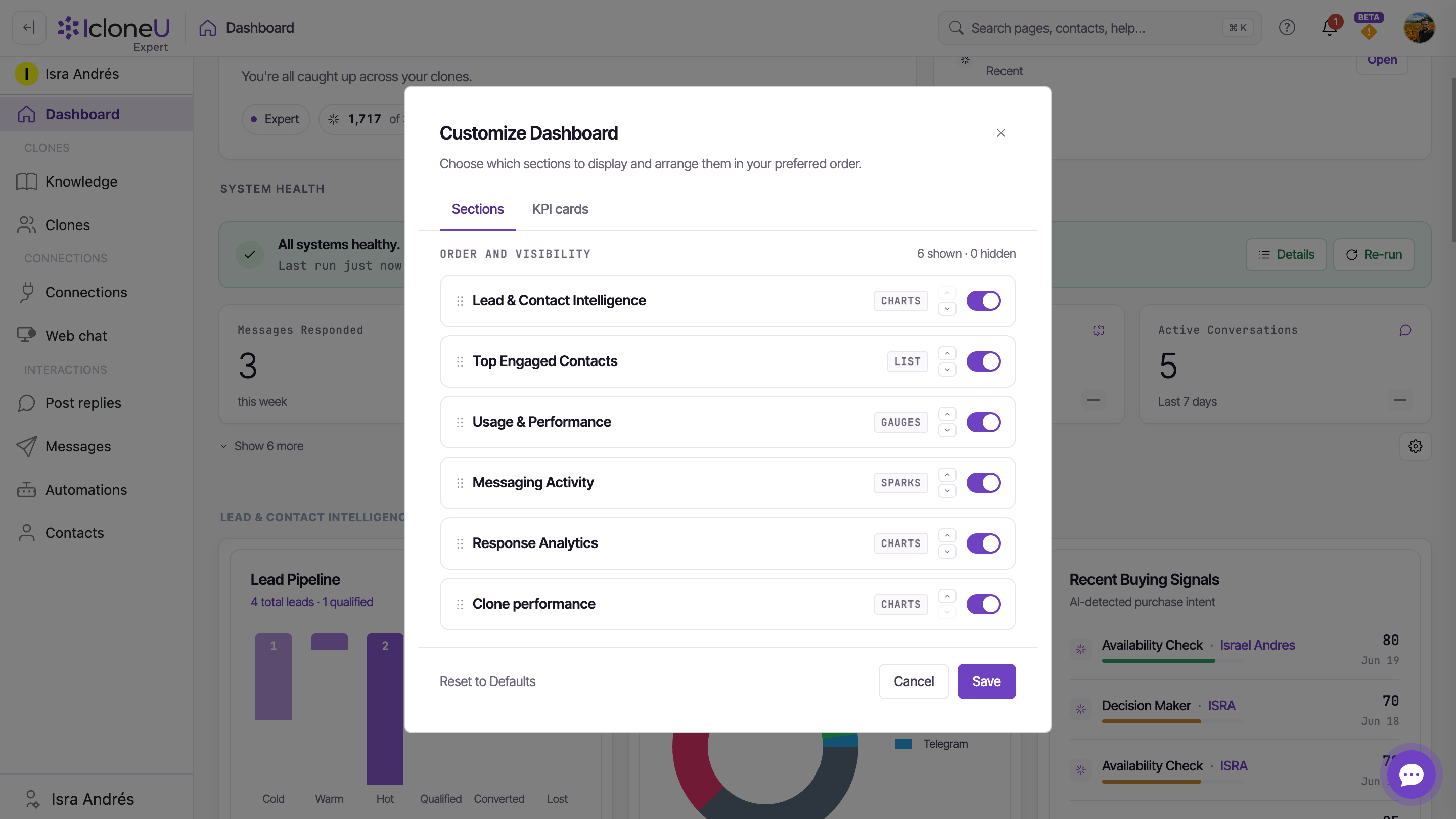
None of this layout is fixed. The gear button at the right of the KPI strip opens the Customize Dashboard dialog, which has two tabs — Sections and KPI cards — and an N shown · M hidden count at the top of each.
Open the dialog
Click the gear at the end of the KPI strip. It opens on the Sections tab; switch to KPI cards with the tab bar to manage the strip instead.
Toggle and reorder
Each row has a drag handle, up / down arrows, and an on-off switch. Drag or arrow rows into the order you want, and flip the switch to show or hide. On the KPI tab the first four visible cards get a TOP 4 badge (always above the fold) and the rest a SHOW MORE badge; hidden ones read HIDDEN.
NoteOn the KPI tab, whichever four visible cards sit highest become your always-on row — so reordering doubles as choosing which metrics stay above the fold.
Save (or reset)
Click Save to apply — nothing changes until you do, and Cancel discards your edits. A Reset to Defaults link restores the out-of-the-box layout.
Frequently asked
It depends which card. On attention cards (Pending Approval, Handover Requested, Unread Notifications) a red +N is just a count of items waiting on you — clear them and the pill goes grey. On trend cards like Conversion Rate, a red down-chevron means the number genuinely fell versus the previous period. The card's sub line is the tell: Needs attention / Unread means it's a queue; vs last month means it's a trend.
A grey em-dash means there's nothing to compare yet — many cards (Messages Responded, Active Leads, Avg Engagement, Active Handovers, Active Conversations) simply don't carry a prior-period value, so they show a dash by design rather than a fake trend. Attention cards also show a grey dash whenever their count is zero.
Today's focus is an action list — it surfaces only the things you can do something about right now (handovers, pending approvals, unread notifications, and Reviews-module items like flagged or held reviews, unreplied published reviews and unanswered questions) with a button to go handle each. The KPI cards are measurement — a steady read on your numbers. There's overlap (a pending-approval count shows in both), but focus is "what should I do today" and the cards are "how are things going."
The Dashboard only reflects real activity. With no Connections active and no Clone replies yet, charts read 0, "No data…" or "…not detected yet". They fill in as you connect channels and your Clones start handling conversations.
Because a conversion is attributed to the month the lead was created. A lead created in June that converts in July raises June's rate — so a closed month's figure can keep moving for a while. It isn't a bug.
Yes — the gear at the right of the KPI strip opens Customize Dashboard, where the Sections and KPI cards tabs let you toggle, reorder and reset everything. Changes apply only after you click Save.
Mostly because they count different replies. Message responses, in Messaging activity, counts only replies to post comments; the Messages Responded card also counts replies in direct messages and web chat. They cover different periods too: the card counts the last 7 days from right now, so it never resets on a fixed day, while Message responses counts the current week from Monday on your own clock and starts again near zero every Monday.
Last updated September 23, 2026 · Getting Started